Choosing the Best Font for Your CV: A Guide
Your CV is your first chance to make a positive impression with recruiters and hiring managers. The presentation of your CV can be just as important as its content. For your best chance of success, aim for an eye-catching CV design that’s clear, well-structured and uses an easy-to-read font. In this article, we discuss how to choose the best font for your CV, with examples of the most popular fonts.

Why the right font for your CV is important
Picking the best font for your CV is an important decision that can help to set the tone for your job application. With so many fonts to choose from, it can be difficult to know which is best. If you choose wisely, your font can help to make a positive impact with employers. As part of the overall design of your CV, the font plays a role in conveying your professionalism, while also reflecting your personality.
The right font should be clear, easy-to-read and strike a professional tone. If your chosen font makes your CV harder to read, it’s likely to impact your chances negatively. Likewise, if it distracts the reader from the document’s content, it’ll probably work against your chances. But you can also run the risk of being too safe with your choice of font, which can mean it doesn’t stand out from other applicants.
As such, careful consideration of your CV’s font is one of your key design decisions. Alongside this decision, you’ll want to decide the size of your font and subtle placement and use of bold or coloured text. All these choices can help make your text stand out and compliment the other design features of your CV.
Expert tip:
Serif vs. sans serif fonts
If you’re wondering what is the best font for a CV, one of the key decisions is whether to use a serif or sans serif typeface. The font family you pick will set the tone for your application. Serif and sans serif fonts represent very different approaches. While serif fonts tend to signify formality, tradition and professionalism, sans serif fonts are more relaxed, modern and stylish.
The type of font you opt for will depend on your own personal style, and the role you’re applying for. If you’re seeking employment in traditional professions such as law, medicine or academia, serif fonts may be more suitable. If, however, you’re applying for roles in media, marketing or tech industries, sans serif fonts might be more suitable.
You can identify serif and sans serif fonts by their features. Serif fonts feature letters with small lines or strokes attached to the ends of some letters. Sans serif fonts include letters without the strokes or lines attached to the extremities of letters. Whether serif or sans serif fonts are the perfect font for your CV will depend on your personal preference.
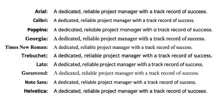
10 most commonly used fonts on CVs
Below you can find a list of the 10 most commonly used fonts on CVs. This doesn’t necessarily mean your perfect CV font is on the list below, but it can give you an idea of what works and why. Some fonts listed below are serif fonts, while others are sans serif fonts. These are the best fonts for a CV in the UK:
The 10 most used CV fonts:
- Arial: A reliable, readable sans serif font with clear lettering and slightly narrow spacing. Arial is a popular choice for all types of professional documents.
- Calibri: A clear sans serif font that’s slightly softer and less formal than Arial. Calibri offers satisfying rounded lettering while remaining professional.
- Poppins: This font provides exceptional clarity and readability. Poppins features generous spacing plus a standard line weight and thickness for attractive sans serif lettering.
- Georgia: A smart, formal serif font with subtle, unobtrusive strokes and lines. An ideal choice for traditional professions CVs with a modern twist.
- Times New Roman: The classic serif-style font with elegant, formal lettering and readable spacing. Conveys a sense of professionalism, tradition and integrity.
- Trebuchet: A modern yet subtle sans serif font. Slightly bolder and more rounded than Arial or Calibri, with short letter tails and rounded dots.
- Lato: This contemporary sans serif typeface strikes a balance between formal and creative styles. Lato combines traditional letter shapes with generous spacing and short tails.
- Garamond: A sharp and stylish serif font that strikes a balance between contemporary and traditional. Garamond is widely used for body text in book printing.
- Noto Sans: The sans serif version of the wide-ranging Noto font family, Noto Sans is a clear and readable font. The style is ideal for CVs with a creative edge.
- Helvetica: Helvetica is an extremely popular sans serif font known for its clear lettering and unfussy design. An ideal choice when you want to make a bold statement with your CV.
CVwizard provides a choice of CV templates with attractive design features and professional CV layouts. Each of the fonts listed above is available in CVwizard’s CV creator. They’re also available for writing your cover letter, so you can select the ideal font for your perfect job application.
The best font size for your CV
Think carefully about the size of your font, and the impact it makes on your CV. Your primary concern when selecting a typeface and font size for your CV is its readability. The best font size for a CV is one that’s accessible and easy-to-read for all readers.
One of your main concerns when writing your CV is likely to be the size of the document. Experts routinely recommend a limit of two pages of A4. A one-page CV is even more desirable. With conflicting pressures to include as much detail as possible, you might be tempted to make your CV font smaller to add more information. However, it’s important to resist this urge. Shrinking your font size can make your CV crowded and less easy to read. It’s better to focus on streamlining your word count to showcase your skills and experience in the most space-efficient way.
The ideal CV font size you select for the body text depends on the font itself. An accessible, readable font size for serif fonts such as Times New Roman is size 12. However, if you want to go smaller, you can use size or 10 or 11 in sans serif fonts, such as Arial. People consider these typefaces to be easier to read than serif fonts, even in smaller sizes. Just remember that recommended CV font sizes typically range between 10 and 12 for body text.
You may want to consider the size of your text for headings. To make your headings stand out, consider using a font size between 14 and 16, or even 18 to 20 for main headings. Subtle and selective use of bold throughout your document can also make it easier to read.
“As part of the overall design of your CV, the font plays a role in conveying your professionalism, while also reflecting your personality.”
Spacing and line-height on your CV
The spacing and line height of your CV all contribute to the readability of the document. You’ll want to make sure your text has enough space around it to make it easy to read. Text that’s too crowded together can be hard on the eye. With recruiters and hiring managers sometimes reviewing hundreds of CVs per job opening, eye fatigue can be a real problem. As such, a CV that’s appropriately spaced can be much more pleasant to read.
Think about the spacing between your headings and body text. You may want to set a spacing of 6pts or 12pts before or after each paragraph, so your headings stand out from the rest of the document. Alternatively, you could set the line spacing of your headings to 1.5. This leaves half a line of space between each line of text. For the body text of your document, you may want to revert to single line spacing. You could also select a line spacing of 1.25 for your body text, to make your document even more readable.
CVwizard’s CV building tool handles line spacing and line height on your CV, so you don’t have to worry about it. When you’re creating your CV, CVwizard takes care of these critical design decisions for you, so you can ensure your document has the optimum layout for a pleasant, accessible reading experience.
Font colour on your CV
As a rule for the readability and accessibility of your CV, it’s best to choose the darkest possible colour on the lightest possible background. For the body text of your CV, black text on a white background is the most accessible choice. This has the highest possible colour-contrast ratio.
If you’re adding subtle design elements into your CV, such as text boxes, coloured columns or coloured headings, you might want to change your font colours. If you’re doing this, be mindful of the colour contrast of your text compared to the background. For light-coloured backgrounds such as pastel shaded boxes, use the darkest possible text. For deep-coloured backgrounds, consider using white text.
Choosing interesting colour palettes for your CV can really enhance the appearance of the document. It can, however, lead to question marks about the document’s readability and accessibility. Search online for colour contrast checkers. These tools that can help with your colour decisions. Aim for a minimum contrast ratio between body text and backgrounds of 4.5:1, or 3:1 for large text such as headings. However, the higher the colour contrast of your CV font compared to the background, the better.
CV formatting considerations
The font you choose for your CV is all part of the wider presentation of your application. Combining the right font size with text colours, suitable line spacing and different font sizing, spacing and italicisation adds to the overall look and feel of your CV. Experiment with layouts that utilise different formatting options, and choose a layout that’s clear and easy to read, while catching and holding the attention of the reader with subtle, professional design elements.
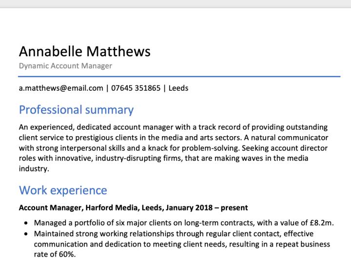
Take a look below for a simple example of using different font sizes and formatting in your CV:
ATS considerations when choosing your CV font
When selecting your CV font, the emphasis should be on readability and professionalism. However, another factor to consider is your chosen font’s compatibility with ATS scanning software. ATS stands for Applicant Tracking System, and many recruiters and employers now use these systems to manage and automate various aspects of the hiring process. One of these elements of the process is initial screening of CVs. ATS software scans your CV and rates it according to your likely match to the job description.
Using standard, established serif or sans serif fonts gives your CV the best chance of being scanned and parsed accurately by an ATS app. This means that every word and section of your CV will count towards the rating the system gives your CV, making it more likely to actually be read by a hiring manager or recruiter.
Fonts to avoid on a CV
There are hundreds of fonts to pick from, and selecting the right one can be overwhelming. However, by following some basic rules, you’re much more likely to pick the best font for your CV. Generally, the most suitable font is the clearest, most readable and most professional. Within that, you have some scope for finding a font that gives your document personality and differentiates it from others, while remaining inherently accessible.
There are also some clear rules for deciding which fonts to avoid. Avoid any fonts for your CV that are very narrow. These may allow you to include more text in your document, but they’re very difficult to read. Likewise, avoid any typefaces with light, thin lines. These don’t stand out well enough from the background. Another rule is not to choose any fonts that attempt to appear ‘handwritten’, such as script or calligraphy-style fonts. Finally, avoid any ‘fun’ fonts such as Comic Sans or Cavolini as these can undermine your professionalism.
Key Takeaways for Deciding a Font for Your CV
Whether you opt for a traditional serif font or a contemporary sans serif font for your CV, make sure it's clear, readable and doesn’t distract from the document’s content. Be mindful of the size and colour of your text, and use larger headings and bold text where appropriate. Choose a font that reflects your personality, while keeping the document professional and unfussy. You can make your CV more beautiful by signing up for CVwizard and accessing our many tools and templates. Use our professional designs to create a CV that improves your chances of success.

Make an impression with your CV
Create and download a professional CV quickly and easily.